
What you will find on this page – LATEST NEWS; CHECK THE PLANET’S VITAL SIGNS (latest update summary); CLIMATE PULSE DAILY STATS (interactive maps); RealClimate articles; 2024 1st year to exceed 1.5oC (graphic animation); International “State of the Climate” report; dangerous climate tipping points will affect Australia – insights for effective policy action (book); window to avoid irreversible climate impacts is ‘rapidly closing (video)’; Explainer: Will global warming ‘stop’ as soon as net-zero emissions are reached? exceeding 1.5 could trigger multiple climate tipping point (graphic); new ocean warming website from NOAA (interactive animation); Annual 2022 Global Climate (report); NOAA State of the Climate 2021 (report); what is climate sensitivity (video); will global warming stop as soon as net zero reached? continuing hype Net Zero 2050; when will we exceed 1.5/2 degrees? NASA links (video); summers ARE getting hotter; greenhouse gases rapidly changing atmosphere; what is pre-industrial level; WMO climate status statement & report for 2016; today’s extremes, tomorrow’s normal (report); Global temperature & CO2 rise from 1850 to 2016 (interactive animation); understanding climate models (video); climate sensitivity; change by trend or steps? tipping points and temperature rise; why do CO2 levels go up and down (video); why nights are getting warmer faster than days; global average temp not same everywhere; current NOAA maps; NASA free data set; “97% scientist agree” (video); James Hansen speaks out (video); Two degree “safe limit”; climate system lag time; trends or steps??
Latest News 22 December 2025, The Guardian: Trump’s shuttering of the National Center for Atmospheric Research is Stalinist. This is the latest in the relentless purge of climate researchers who refuse to be co-opted by the fossil fuel industry. The Soviet dictator Joseph Stalin would no doubt have understood and even appreciated the latest attack by the Trump administration on climate researchers and their work. The National Center for Atmospheric Research in Boulder, Colorado, is to be dismantled after more than 50 years at the forefront of global research on climate science and monitoring. This is the latest step in the administration’s climate Lysenkoism and its relentless purge of climate researchers who refuse to be co-opted into its quest for American energy dominance though fossil fuels. Stalin’s embrace of the work of Trofim Denisovitch Lysenko, who wrongly believed that wheat could inherit characteristics acquired by previous generations, underpinned policies that failed to prevent crop failures and millions of deaths from famine during the 1930s. Scientists who opposed Lysenkoism were denounced, fired, imprisoned and even executed. While Trump has not gone as far as Stalin, his administration’s persecution of climate researchers could ultimately lead to many millions of deaths from increases in extreme weather and sea level rise in the United States and across the world. Read more here 17 December 2025, SCI AM: Scientists Denounce Trump’s Plan to Kill Crucial Atmospheric Science Center. The U.S. government is dismantling the National Center for Atmospheric Research, jettisoning key climate science projects in the process. The Trump administration is dismantling the National Center for Atmospheric Research (NCAR), long considered the crown jewel in the U.S.’s earth science infrastructure. Scientists who study climate, weather and other earth sciences have decried the move, first reported by USA Today, as “taking a sledgehammer” to an “iconic” center dedicated to studying our planet. “NCAR is quite literally our global mothership,” wrote Katharine Hayhoe, a climate scientist at Texas Tech University and chief scientist of the Nature Conservancy, on Bluesky. “Dismantling NCAR is like taking a sledgehammer to the keystone holding up our scientific understanding of the planet. Unbelievable.” The center, based in Boulder, Colo., has become a target because of what Russ Vought, director of the White House Office of Management and Budget, described as “climate alarmism” in a statement to USA Today. Weather modeling and supercomputing work also done at the center will be moved to other research hubs, Vought said. Read more here 10 September 2025, BBC: Protect Arctic from ‘dangerous’ climate engineering, scientists warn. Plans to fight climate change by manipulating the Arctic and Antarctic environment are dangerous, unlikely to work and could distract from the need to ditch fossil fuels, dozens of polar scientists have warned. These polar “geoengineering” techniques aim to cool the planet in unconventional ways, such as artificially thickening sea-ice or releasing tiny, reflective particles into the atmosphere. They have gained attention as potential future tools to combat global warming, alongside cutting carbon emissions. But more than 40 researchers say they could bring “severe environmental damage” and urged countries to simply focus on reaching net zero, the only established way to limit global warming. Geoengineering – deliberately intervening in the Earth’s climate system to counter the impacts of global warming – is one of the most controversial areas of climate research. Some types are widely accepted – removing planet-warming carbon dioxide from the atmosphere via planting trees or using machines, for example, are recognised parts of net zero efforts. Net zero means balancing the amount of planet-warming “greenhouse” gases produced by human activities with the amount being actively removed from the atmosphere. But some more radical geoengineering ideas, like reflecting sunlight “are dealing with the symptoms of climate change rather than the causes,” said lead author Martin Siegert, professor of geosciences at the University of Exeter. Read more here 8 September 2025, CarbonBrief: Guest post: How the role of carbon storage has been hugely overestimated. Removing carbon dioxide (CO2) from the atmosphere is widely expected to play a key role in meeting the goals of the Paris Agreement. But this will only be effective for slowing climate change if the CO2 can be stored securely and indefinitely. This requires “geological carbon storage”, where captured CO2 is injected deep underground, where it can stay trapped for thousands of years. While the current deployment of CO2 removal (CDR) technologies around the world is small, almost all facilities aim to store captured CO2 in sedimentary basins. However, in our study in Nature, we show that current policy approaches to using these formations on a larger scale could be suffering from a false sense of abundance. We find that – once technical, social and environmental risks are considered – the world’s available reserves of geological carbon storage are significantly more limited than most estimates suggest. Our research shows that, of nearly 12,000bn tonnes of CO2 (GtCO2) of theoretical carbon storage capacity, just 1,460GtCO2 is risk-free. Significantly, we find that, if all available safe carbon storage capacity were used for CO2 removal, this would contribute to only a 0.7C reduction in global warming. In short, geological carbon storage is not limitless – on the contrary, its practical potential is a rather scarce planetary resource. Read more here End Latest News Wanting to know the latest stats for how our planet is managing? Access NASA’s Vital Signs page which is continually updated for: Carbon Dioxide; Global Temperature; Methane; Ocean Warming; Ice Sheets; Sea Level & Arctic Ice. ACCESS VITAL SIGNS HERE “Assuming present trends continue, the odds are quite good that we’ll become the best informed extinct species on the planet!” Measuring, observing and reporting

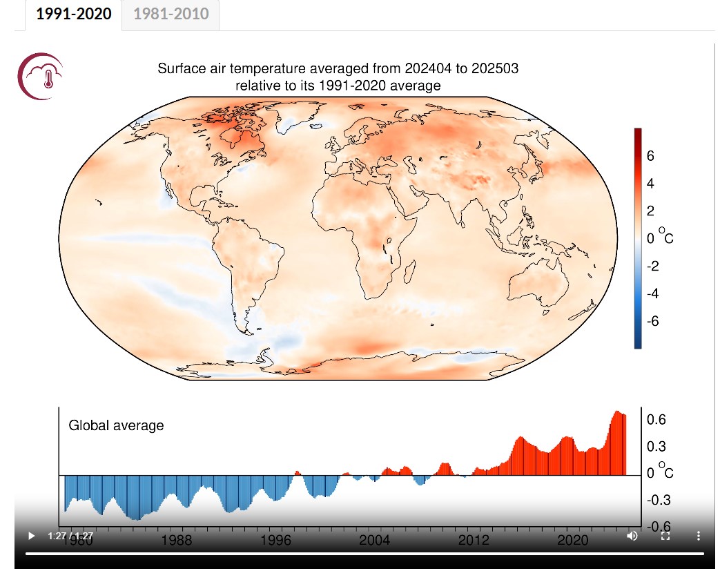
 Climate Pulse is a new interactive web application developed and maintained by the Copernicus Climate Change Service (C3S) to make climate monitoring more accessible to a broad audience. This page provides daily charts and maps of global surface air temperature and sea surface temperature updated close to real-time, as well as an archive of past daily, monthly and annual maps.ACCESS INTERACTIVE MAPS HERE
 “What’s the use of having developed a science well enough to make predictions if in the end all we’re willing to do is stand around and wait for them to come true.” Sherwood Rowland
 ![]()
Here are some links to their continuing analysis:
12 October 2025: The #AMOC is the reason for Europe’s mild climate. Evidence that it is slowing has been piling up over the years – it now is likely at its weakest in at least a millennium, and it may even be approaching a tipping point. Here I will show you the latest high-resolution images – and also discuss whether there is serious evidence speaking against an ongoing AMOC weakening. This weakening is of particular concern because the AMOC has a tipping point, and our recent study has shown that in many of the standard future global warming simulations performed for the current IPCC report the AMOC passes that tipping point and shuts down in the following decades. The Guardian rightly titled that this danger “is no longer low-likelihood”, as we had discussed it for decades. Read more here
12 May 2025: The Arctic Council’s Arctic Monitoring and assessment Programme (AMAP) recently released a Summary for PolicyMakers’ Arctic Climate Change Update 2024. It is one of several stock taking exercises on the regional and global states of Earth’s climate. The other reports include the 2024 European State of the Climate (ESOTC) report, NOAA’s Assessing the Global Climate in 2024, Berkeley Earth, and the World Meteorological Organization’s (WMO) state of the climate 2024. So why bother with several similar assessments? One reason is that they have been written by different people who independently come to the same conclusion: Earth’s climate is changing at a fast pace, and 2024 was the warmest year measured in modern times. The warming in the Arctic is particularly fast due to an effect known as the polar amplification. Another question is why we should care about the changes in the Arctic that are documented in the most recent AMAP report. There are several changes in the Arctic that will affect both the globe as well as the mid-latitudes.Read more here
19 March 2025: Andean glaciers have shrunk more than ever before in the entire Holocene. Glaciers are important indicators of climate change. A recent study published in the leading journal Science shows that glaciers in the tropical Andes have now retreated further than at any other time in the entire Holocene – which covers the whole history of human civilisation since the invention of agriculture. These findings are likely to resonate beyond the scientific community, as they strongly support the lawsuit filed by a Peruvian farmer against the energy company RWE, which has returned to court this week. Read more here
26 February 2025: I’ve been getting a lot of media queries about a new paper on the AMOC (Atlantic Meridional Overturning Circulation), which has just been published. In my view this large media interest is perhaps due to confusing messages conveyed in the title of the paper and in press releases about it by the journal Nature and by the Met Office. Whether intended or not, these give the impression that new model results suggest that the AMOC is more resilient than previously thought. That’s (unfortunately!) not the case. Read more here
26 January 2025: The AMOC is slowing, it’s stable, it’s slowing, no, yes, … There’s been a bit of media whiplash on the issue of AMOC slowing lately – ranging from the AMOC being “on the brink of collapse” to it being “more stable than previously thought”. AMOC, of course, refers to the Atlantic Meridional Overturning Circulation, one of the worlds major ocean circulation systems which keeps the northern Atlantic region (including Europe) exceptionally warm for its latitude. So what is this whiplash about? Read more here
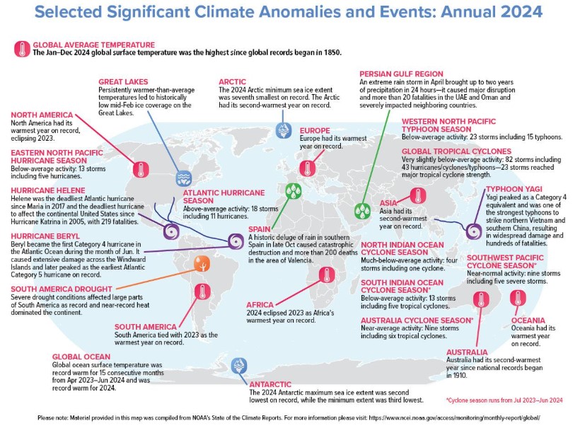
10 January 2025: 2024 is confirmed by the Copernicus Climate Change Service (C3S) to be the warmest year on record globally, and the first calendar year that the average global temperature exceeded 1.5°C above its pre-industrial level. C3S is implemented on behalf of the European Commission by the European Centre for Medium-Range Weather Forecasts (ECMWF), whose scientists have been monitoring key climate indicators, and documenting unprecedented daily, monthly, and annual temperature records over 2024. Human-induced climate change remains the primary driver of extreme air and sea surface temperatures; while other factors, such as the El Niño Southern Oscillation (ENSO), also contributed to the unusual temperatures observed during the year.Read more here
This year the following organisations involved in global climate monitoring – ECMWF, NASA, NOAA, the UK Met Office, Berkeley Earth and the World Meteorological Organisation (WMO), have made a concerted effort to coordinate the release of their data, highlighting the exceptional conditions experienced during 2024.
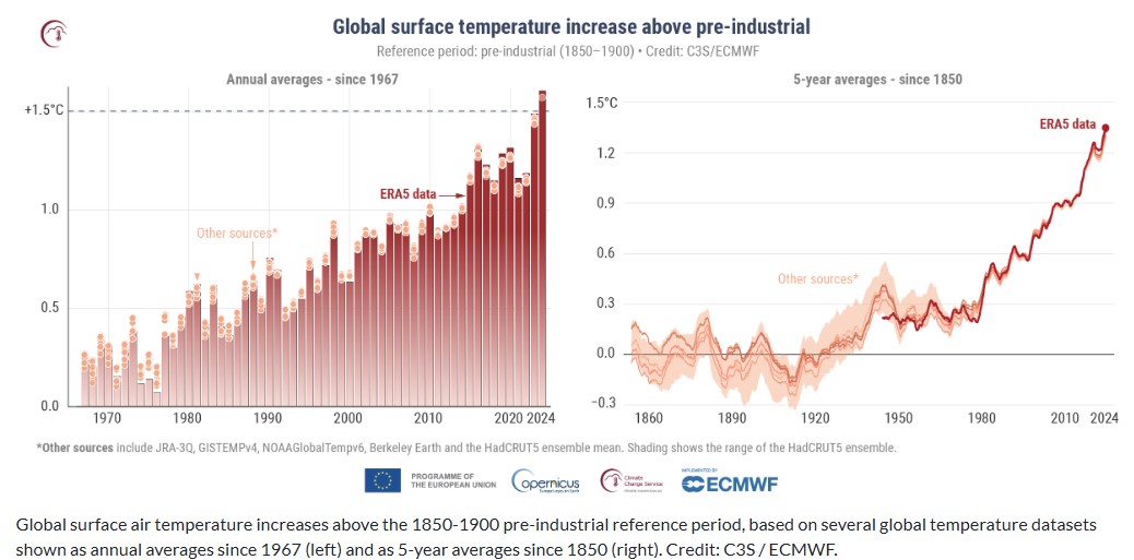
Copernicus animated graphic of surface air temperature – access animation here
Europe, the UK city of Exeter recently played host to the second international conference on “tipping points”.
… Prof Ricarda Winkelmann, the third convenor of the conference and professor of climate system analysis at PIK, discussed tipping of the Greenland and West Antarctic ice sheets, which together hold enough ice to raise global sea levels by 65 metres. Winkelmann encouraged the delegates to consider timescales. She described tipping of the ice sheets as “slow-onset systems”, but highlighted that they can also “undergo quick and abrupt changes”. To demonstrate this, she played a video of “calving” from the Ilulissat glacier in western Greenland. This was the largest calving ever caught on camera, which saw chunks of ice up to 1,000-metres thick break off the main ice sheet, she said. Winkelmann described a “time clash” between the long-term changes in biophysical systems and short-term changes in socioeconomic systems. She concluded: “The choices and actions implemented in this decade really have impacts now and also for the next 1,000 years.” Access full report here.
17 November 2024: Operationalizing Climate Science. There is a need to make climate science more agile and more responsive, and that means moving (some of it) from research to operations. Readers here will know that the climate science community has had a hard time giving quantitative explanations for what’s happened in climate over the last couple of decades. Similarly, we are still using scenarios that were designed more than a decade ago and have not been updated to take account of the myriad changes that have happened since. Many people have noticed these problems and so there are many ideas floating around to fix them. As someone who works in one of the main modeling groups that provide their output to the IPCC and NCA assessments, and whose models inform the downscaled projections that are used in a lot of climate resilience work, I’ve been active in trying to remedy this state of affairs. For the CERESMIP project (Schmidt et al., 2023) we proposed updating the forcings datasets and redoing much of the attribution work that had been done before to focus specifically on explaining the trends in the CERES time period (2003 to present). Read more here
25 August 2023: The AMOC: tipping this century, or not? A few weeks ago, a study by Copenhagen University researchers Peter and Susanne Ditlevsen concluded that the Atlantic Meridional Overturning Circulation (AMOC) is likely to pass a tipping point already this century, most probably around mid-century. Given the catastrophic consequences of an AMOC breakdown, the study made quite a few headlines but also met some skepticism. Now that the dust has settled, here some thoughts on the criticisms that have been raised about this study.Read more here
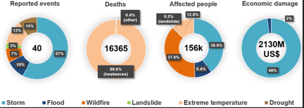
19 June 2023: WMO, C3S release sombre findings in joint State of the Climate in Europe 2022 report. The key findings in the 2022 edition of the World Metrological Organization’s (WMO) State of the Climate in Europe report, produced jointly with the Copernicus Climate Change Service (C3S*), paint a sombre picture for Europe last year. According to the findings, Europe is the fastest warming of all the WMO regions, warming twice as much as the global average since the 1980s. What’s more, high-impact weather and climate events in 2022 resulted in over 16,000 reported fatalities, of which 99.6% were attributed to heatwaves.In 2022, the annual average temperature in Europe was between the second and fourth highest on record, depending on the data set used, and for many countries in western and south-western Europe last year was the warmest year on record. According to the report, which was presented at the 6th European Climate Change Adaptation Conference (ECCA2023) in Dublin on 19 June, the summer of 2022 was the warmest on record and Europe experienced several exceptional heatwaves over the summer months, the most severe of which occurred in mid-July, with record-breaking temperatures in many locations, including the United Kingdom where the temperature exceeded 40°C for the first time.
2022 was not only warm, it was dry – with precipitation below average across much of the region. 2022 was the fourth dry year in a row on the Iberian Peninsula, and the third consecutive dry year in the mountain regions of the Alps and Pyrenees. The lack of precipitation, in particular winter snow, combined with high summer temperatures, contributed to the largest loss of glacial ice ever recorded in the European Alps.
A year of extremes: Europe in 2022 was characterised by several weather-, climate- and water-related extreme events. According to the Emergency Events Database (EM-DAT), cited in the report, there were 40 meteorological, hydrological and climate-related hazards in Europe in 2022, which resulted in 16,365 reported fatalities and 156,000 people directly affected. About 67% of the events were flood- and storm-related, leading to dozens of fatalities. read more here
24 July 2023: What is happening in the Atlantic Ocean to the AMOC? For various reasons I’m motivated to provide an update on my current thinking regarding the slowdown and tipping point of the Atlantic Meridional Overturning Circulation (AMOC). I attended a two-day AMOC session at the IUGG Conference the week before last, there’s been interesting new papers, and in the light of that I have been changing my views somewhat. Here’s ten points, starting from the very basics, so you can easily jump to the aspects that interest you. 1. The AMOC is a big deal for climate. The Atlantic meridional overturning circulation (AMOC) is a large-scale overturning motion of the entire Atlantic, from the Southern Ocean to the high north. It moves around 15 million cubic meters of water per second (i.e. 15 Sverdrup). The AMOC water passes through the Gulf Stream along a part of its much longer journey, but contributes only the smaller part of its total flow of around 90 Sverdrup. The AMOC is driven by density differences and is a deep reaching vertical overturning of the Atlantic; the Gulf Stream is a near-surface current near the US Atlantic coast and mostly driven by winds. The AMOC however moves the bulk of the heat into the northern Atlantic so is highly relevant for climate, because the southward return flow is very cold and deep (heat transport is the flow multiplied by the temperature difference between northward and southward flow). Read more here
23 July 2023: Area-based global hydro-climatological indicators. The World Meteorological Organisation (WMO) Global Climate Observing System (GCOS) and Copernicus Climate Change Services (C3S) both provide sets of global climate statistics to summarise the state of Earth’s climate. They are indeed valuable indicators for the global or regional mean temperature, greenhouse gas concentrations, both ice volume and area, ocean heat, acidification, and the global sea level. Still, I find it surprising that the set does not include any statistics on the global hydrological cycle, relevant to rainfall patterns and droughts. Two obvious global hydro-climatological indicators are the total mass of water falling on Earth’s surface each day P and the fraction of Earth’s surface area on which it falls Ap. Global surface area can now be analysed with satellite observations and global reanalyses such as the ERA5 reanalysis. Apparently, Earth’s fractional surface area receiving daily precipitation, Ap, has shrunk over time while the total mass of water falling on Earth’s surface P has increased. Furthermore, our recent analysis suggests that there is a strong correlation between the spatial scales of rainfall patterns and the global mean temperature (Benestad et al, 2022). Read more here
8 July 2023: Back to basics. You can tell how worried the climate deniers are by how many fields of science they have to trash to try and have people not see what’s happening. it will not have escaped most people’s notice that global temperatures are heading into uncharted territory. The proximate cause of this week’s headlines is the Climate Reanalyzer website at the U. Maine which provides a nice front end to the NOAA NCEP CFS forecast system and reanalysis and shows absolute daily temperatures in early July clearly exceeding the highest pre-existing temperatures from August 2016. It’s an arresting graphic, and follows in from the record high ocean surface temperatures that were being reported a month ago. This is however a relatively new resource and was not online the last time that we set absolute temperature records (in summer 2016). So this has both salience and novelty – a potent combination! The ultimate cause of these patterns is of course the ongoing global warming, driven almost entirely by human activities. Read more here
7 April 2023: The summary for policymakers of the Intergovernmental Panel on Climate Change sixth assessment reports synthesis. The summary for policymakers of the Intergovernmental Panel on Climate Change (IPCC) sixth synthesis report was released on March 20th (available online as a PDF). There is a recording of the IPCC Press Conference – Climate Change 2023: Synthesis Report for those who are interested in watching an awkward release of the report…My concern is that the IPCC stubbornly has stuck to a format which so far hasn’t worked, as we can glean from the graphic presented below. Its “calibrated language” and the way its reports are written apparently don’t work, Read more here
13 January 2023: 2022 updates to the temperature records. Another January, another annual data point. As in years past, the annual rollout of the GISTEMP, NOAA, HadCRUT and Berkeley Earth analyses of the surface temperature record have brought forth many stories about the long term trends and specific events of 2022 – mostly focused on the impacts of the (ongoing) La Niña event and the litany of weather extremes (UK and elsewhere having record years, intense rainfall and flooding, Hurricane Ian, etc. etc.). But there are a few things that don’t get covered much in the mainstream stories, and so we can dig into them a bit here. Read more here
Dangerous climate tipping points will affect Australia. The risks are real and cannot be ignored
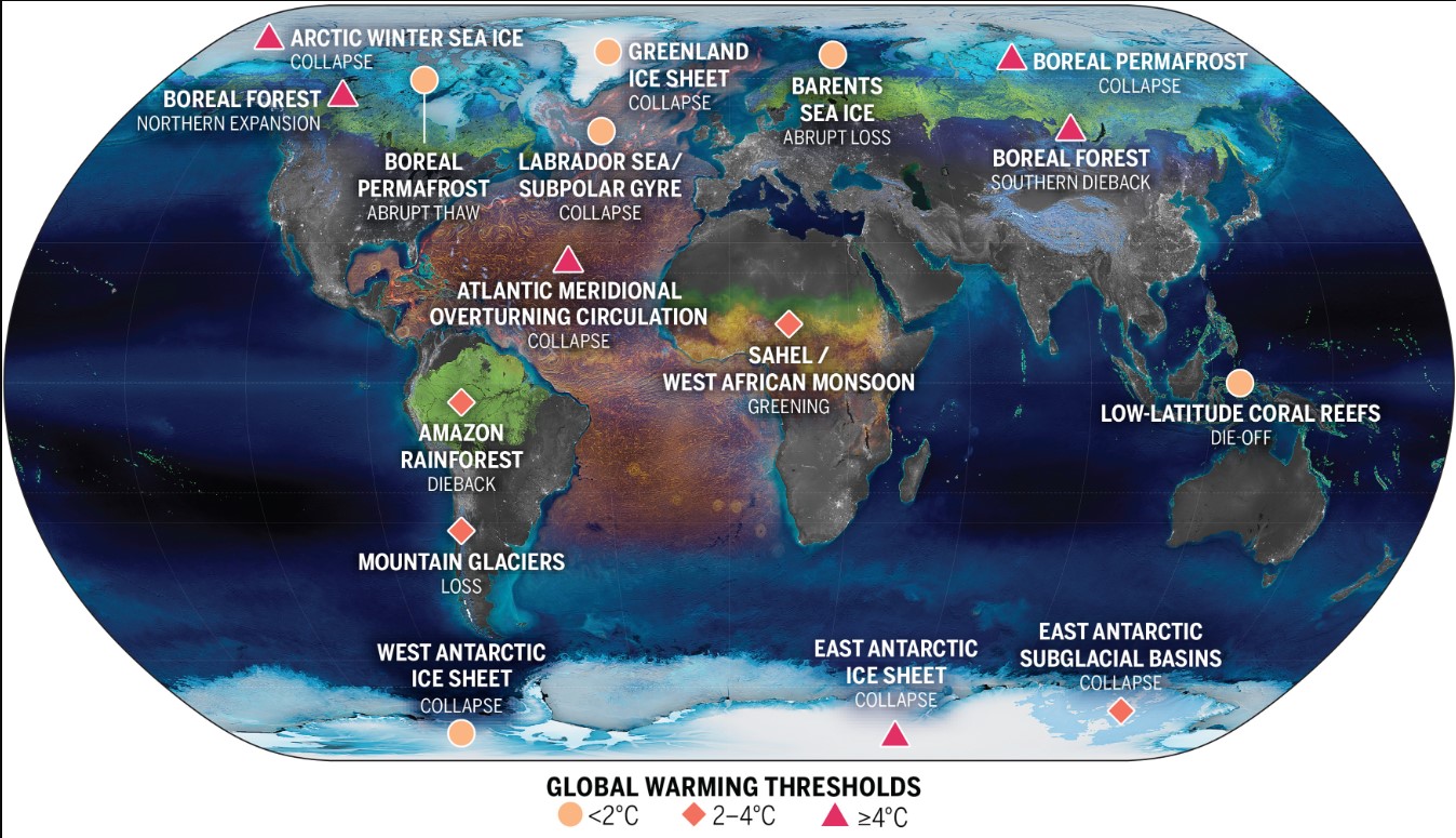
6 February 2024, The conversation: Dangerous climate tipping points will affect Australia. The risks are real and cannot be ignored. n 2023, we saw a raft of news stories about climate tipping points, including the accelerating loss of Greenland and Antarctic ice sheets, the potential dieback of the Amazon rainforest and the likely weakening of the Atlantic Meridional Ocean Circulation. The ice sheets, Amazon rainforest and the Atlantic ocean circulation are among nine recognised global climate tipping elements. Once a tipping point is crossed, changes are often irreversible for a very long time. In many cases, additional greenhouse gases will be released into the atmosphere, further warming our planet. New scientific research and reviews suggest at least one of Earth’s “tipping points” could be closer than we hoped. A milestone review of global tipping points was launched at last year’s COP28. What will these tipping points mean for Australia? We don’t yet have a good enough understanding to fully answer this question. Our report, released overnight, includes conclusions in three categories: we need to do more research; tipping points must be part of climate projections, hazard and impact analyses; and adaptation plans must take the potential impacts into account.
What are climate tipping points? Climate scientists have known for a while, through paleoclimate records and other evidence, that there are “tipping elements” in the climate system. These elements can undergo an abrupt change in state, which becomes self-perpetuating and irreversible for a very long time. An example is the loss of Greenland ice. Once ice is lost, climate feedbacks lead to further loss, and major ice loss becomes “committed”. It becomes unlikely the ice sheet will reform for tens of thousands of years and only if the climate cools again. Read more here
TO ACCESS FULL CSIRO REPORT ACCESS THIS LINK: CSIRO_Tipping-Points-Report
Climate Tipping Points: Insights for Effective Policy Action
 2022 OECD – BOOK: A tipping point is a critical threshold beyond which a system reorganises, often abruptly and/or irreversibly and a tipping element is an Earth system component that is susceptible to a tipping point. Key tipping elements include the collapse of the West Antarctic and Greenland Ice Sheets, the melting of the Arctic Permafrost, the collapse of the Atlantic Meridional Overturning Circulation and the dieback of the Amazon Forest. The goal of this report is to review the state of knowledge on climate system tipping points and to make recommendations for a wide range of stakeholders, on how climate risk management strategies can adequately reflect the risks of crossing tipping points.
The crossing of climate system tipping points may lead the climate to change regionally or globally, both by substantially affecting the Earth system and as a result of tipping cascades, leading to potentially catastrophic impacts. Tipping points impacts will also cascade through socio-economic and ecological systems over timeframes that are short enough to defy the ability and capacity of human societies to adapt, leading to severe effects on human and natural systems. At the regional level, individual tipping points are associated with different types of potentially severe regional or local impacts, such as extreme temperatures, higher frequency of droughts, forest fires and unprecedented weather. At the global scale, tipping points would lead to world-wide impacts through e.g. contributing to additional greenhouse gas emissions into the atmosphere and temperature feedback loops or to faster sea-level rise. Read more here
Exceeding 1.5°C global warming could trigger multiple climate tipping points
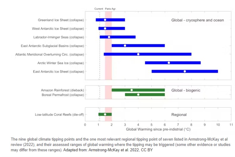
9 September 2022, Science Journal: . Climate tipping points are conditions beyond which changes in a part of the climate system become self-perpetuating. These changes may lead to abrupt, irreversible, and dangerous impacts with serious implications for humanity. Armstrong McKay et al. present an updated assessment of the most important climate tipping elements and their potential tipping points, including their temperature thresholds, time scales, and impacts. Their analysis indicates that even global warming of 1°C, a threshold that we already have passed, puts us at risk by triggering some tipping points. This finding provides a compelling reason to limit additional warming as much as possible… Our assessment provides strong scientific evidence for urgent action to mitigate climate change. We show that even the Paris Agreement goal of limiting warming to well below 2°C and preferably 1.5°C is not safe as 1.5°C and above risks crossing multiple tipping points. Crossing these CTPs can generate positive feedbacks that increase the likelihood of crossing other CTPs. Currently the world is heading toward ~2 to 3°C of global warming; at best, if all net-zero pledges and nationally determined contributions are implemented it could reach just below 2°C. This would lower tipping point risks somewhat but would still be dangerous as it could trigger multiple climate tipping points. Read more here
Explainer: Will global warming ‘stop’ as soon as net-zero emissions are reached?
29 April 2021, Carbon Brief: Media reports frequently claim that the world is facing “committed warming” in the future as a result of past emissions, meaning higher temperatures are “locked in”, “in the pipeline” or “inevitable”, regardless of the choices society takes today. The best available evidence shows that, on the contrary, warming is likely to more or less stop once carbon dioxide (CO2) emissions reach zero, meaning humans have the power to choose their climate future. When scientists have pointed this out recently, it has been reported as a new scientific finding. However, the scientific community has recognised that zero CO2 emissions likely implied flat future temperatures since at least 2008. The Intergovernmental Panel on Climate Change (IPCC) 2018 special report on 1.5C also included a specific focus on zero-emissions scenarios with similar findings. Much of the confusion around committed warming stems from mixing up two different concepts: a world where CO2 levels in the atmosphere remain at current levels; and a world where emissions reach net-zero and concentrations begin to fall…
The studies featured in this piece all look at the effects of zero-emissions scenarios today or in the next few decades. If, however, zero emissions were to occur later in the century, there is the potential to lock in more carbon-cycle feedback processes – such as melting permafrost – than under current global temperature levels. A world that has warmed by 3C or 4C above pre-industrial levels may lock in more committed future warming than today’s world – and more research is needed to explore these effects.
Finally, while current best estimates suggest that temperatures will stabilise in a zero-emissions world, that does not mean that all climate impacts would cease to worsen. Melting glaciers and ice sheets and rising sea levels all occur slowly and lag behind surface temperature warming. A zero-emissions world would still result in rising sea levels for many centuries to come, with some estimates suggesting that at least 80cm of additional sea level rise is “locked in”. Read more here
New ocean warming website from NOAA – Ocean warming since 1991 doubles the size of the marine heat wave forecasted for September 2023
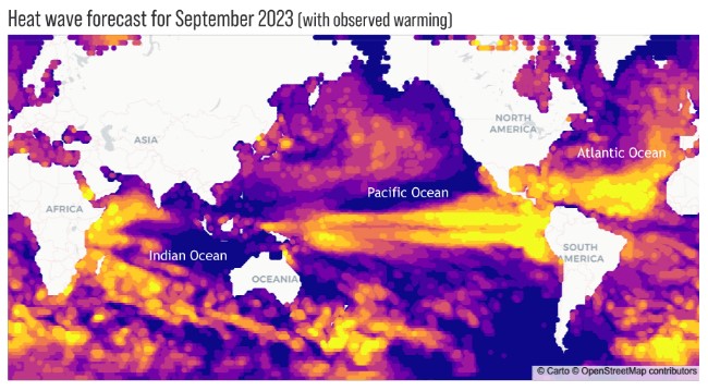 7 July 2023, NOAA: Earlier this week, NOAA launched a new website for monitoring and forecasting the size and intensity of ocean heat waves up to a year in advance. According to the experimental forecast issued in June, 50 percent of the global oceans could experience heat wave conditions by September 2023. The forecast system also estimates how large and intense heat waves are without global warming’s influence on the ocean over the past three decades. Without the warming effect, the models predict that only 25 percent of the global ocean will be impacted by heat waves in September. …
Marine heat waves can cause mass coral bleaching, toxic algal blooms, and other heat-related disruptions of ocean ecosystems. These impacts can lead to mass die-offs of fish, marine mammals, and seabirds. Billions of dollars are lost in such events around the world each year. The new marine heatwave site can help fishing fleets, ocean managers, and coastal communities anticipate and prepare for the variety of impacts that occur during these events.
Read the full web story or explore the site on your own.
Annual 2022 Global Climate Report – NOAA
12 January 2023: According to NOAA scientists, the global surface temperature for 2022 was the sixth highest since record keeping began in 1880. In a separate analysis of global temperature data also released today, NASA ranks 2022 as the fifth-warmest year on record, tying with 2015. Analysis from the Copernicus program ranked 2022 as the fifth-warmest year on record. December’s global surface temperature was the eighth highest in the 143-year record, according to NOAA. This summary from NOAA National Centers for Environmental Information is part of the suite of climate services that NOAA provides to government, business, academia, and the public to support informed decision-making.
Global land and ocean surface temperature: The 2022 average temperature across global surfaces was 1.55°F (0.86°C) above the 20th-century average of 57.0°F (13.9°C) – the sixth highest among all years in the 1880-2022 record. This was also the 46th-consecutive year (since 1977) with global temperatures, at least nominally, above the 20th-century average. The 10-warmest years on record have all occurred since 2010, with the last nine years (2014-2022) among the 10-warmest years.
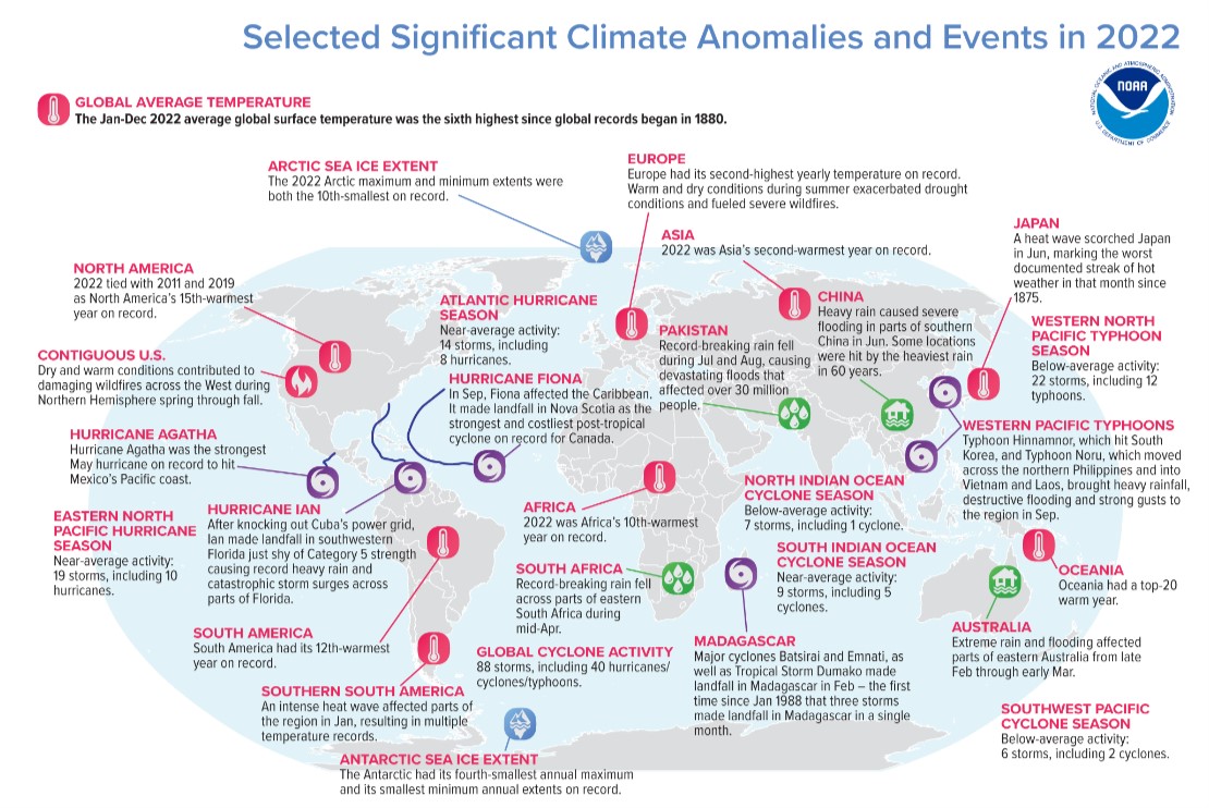
Related Links: Climate at a Glance; Global Temperature and Precipitation Maps; Temperature Percentiles Explained; Precipitation Percentiles Explained; State of the Climate Summaries
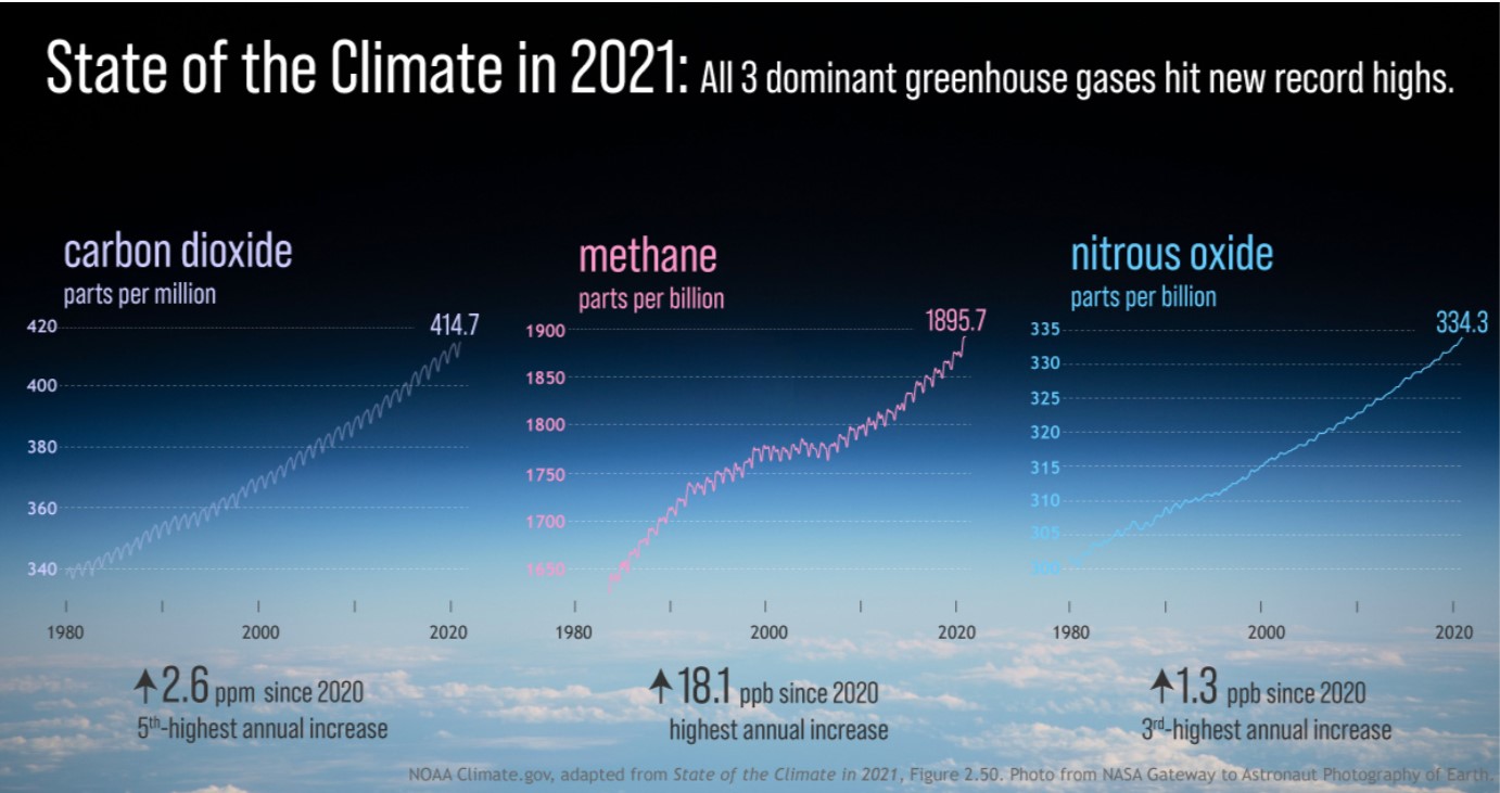
State of the Climate in 2021
30 Aug 2022, NOAA Climate.gov: The international annual review of the world’s climate, led by scientists from NOAA’s National Centers for Environmental Information and published by the Bulletin of the American Meteorological Society (AMS), is based on contributions from more than 530 scientists in over 60 countries. It provides the most comprehensive update on Earth’s climate indicators, notable weather events and other data collected by environmental monitoring stations and instruments located on land, water, ice and in space.
“The data presented in this report are clear — we continue to see more compelling scientific evidence that climate change has global impacts and shows no sign of slowing,” said NOAA Administrator Rick Spinrad, Ph.D. “With many communities hit with 1,000-year floods, exceptional drought and historic heat this year, it shows that the climate crisis is not a future threat but something we must address today as we work to build a Climate-Ready Nation — and world — that is resilient to climate-driven extremes.” Access here the full report
Explainer: How scientists estimate ‘climate sensitivity’
19 June 2018, Carbon Brief: The sensitivity of the Earth’s climate to increases in atmospheric CO2 concentration is a question that sits at the heart of climate science. Essentially, it dictates how much global temperatures will rise in response to human-caused CO2 emissions, but it is a question that does not yet have a clear answer. For many years, estimates have put climate sensitivity somewhere between 1.5C and 4.5C of warming for a doubling of pre-industrial CO2 levels. This range has remained stubbornly wide, despite many individual studies claiming to narrow it. However, recent work combining multiple lines of evidence may have helped modestly narrow this range. Here, Carbon Brief examines studies of climate sensitivity published over the past two decades. These studies use climate models, recent observations and palaeoclimate data from the Earth’s more distant past to estimate climate sensitivity. While narrowing the range of sensitivity will not change the need for rapid decarbonisation, it may help policymakers fine-tune their plans for the future. Different types of sensitivity Climate sensitivity refers to the amount of global surface warming that will occur in response to a doubling of atmospheric CO2 concentrations compared to pre-industrial levels. Read more here
Explainer: Will global warming ‘stop’ as soon as net-zero emissions are reached?
29 April 2022, Carbon Brief: Media reports frequently claim that the world is facing “committed warming” in the future as a result of past emissions, meaning higher temperatures are “locked in”, “in the pipeline” or “inevitable”, regardless of the choices society takes today. The best available evidence shows that, on the contrary, warming is likely to more or less stop once carbon dioxide (CO2) emissions reach zero, meaning humans have the power to choose their climate future.
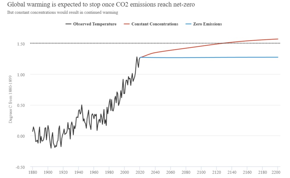 When scientists have pointed this out recently, it has been reported as a new scientific finding. However, the scientific community has recognised that zero CO2 emissions likely implied flat future temperatures since at least 2008. The Intergovernmental Panel on Climate Change (IPCC) 2018 special report on 1.5C also included a specific focus on zero-emissions scenarios with similar findings. Much of the confusion around committed warming stems from mixing up two different concepts: a world where CO2 levels in the atmosphere remain at current levels; and a world where emissions reach net-zero and concentrations begin to fall. Even in a world of zero CO2 emissions, however, there are large remaining uncertainties associated with what happens to non-CO2 greenhouse gases (GHGs), such as methane and nitrous oxide, emissions of sulphate aerosols that cool the planet and longer-term feedback processes and natural variability in the climate system. Moreover, temperatures are expected to remain steady rather than dropping for a few centuries after emissions reach zero, meaning that the climate change that has already occurred will be difficult to reverse in the absence of large-scale net negative emissions.
Continuing hype of “Net Zero 2050” – please read the small print
Net-zero greenhouse gas emission does not have any geophysical significance
The basis of this relationship is the rough balance between the net uptake of carbon into deep pools (mainly the deep ocean) and the rate at which the oceans warm in response to an energy imbalance. We’ve discussed ‘commitment’ issues before, and to zeroth order global temperature is basically stable once CO2 emissions stop. Thus future warming is totally dependent on future emissions. These relationships implies that once cumulative emissions stop (i.e. net-zero is reached), the eventual warming is set.
This is a very important result, and one that underlies the recent pledges to achieve net-zero by 2030/2040/2050 etc. coming as part of the upgrade to Nationally Determined Contributions (NDCs) for the COP26 meeting. Access blog here.
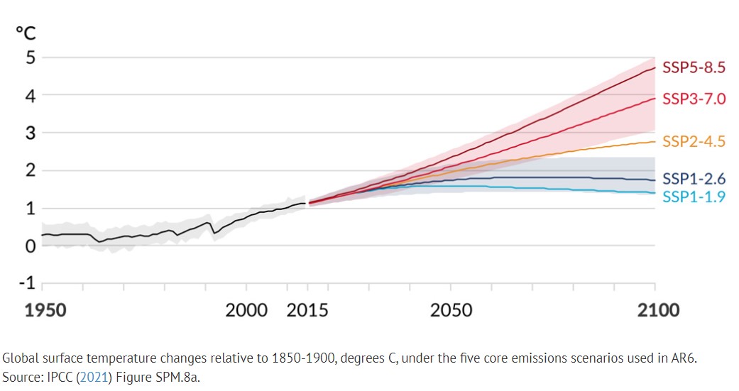
Analysis: When might the world exceed 1.5C and 2C of global warming?
4 December 2020, Carbon Brief: Under the Paris Agreement adopted in 2015, virtually all the world’s nations pledged to limit global warming to “well below” 2C above pre-industrial levels and also, if possible, “pursue” efforts to cap warming at 1.5C. At present, the world is not close to being on track to meet either target. While the growth of global emissions has slowed in recent years, there is a large and growing gap between current commitments and what would be needed to avoid exceeding these global temperature limits. Here, Carbon Brief provides an analysis of when the world is expected to pass these limits in the absence of large future emissions reductions. This is based on the latest generation of climate models – known as ”CMIP6” (see Carbon Brief’s explainer) – that are being run in the lead up to the Intergovernmental Panel on Climate Change’s (IPCC) sixth assessment report expected in 2021-22.
Our analysis shows that:
- The world will likely exceed 1.5C between 2026 and 2042 in scenarios where emissions are not rapidly reduced, with a central estimate of between 2030 and 2032.
- The 2C threshold will likely be exceeded between 2034 and 2052 in the highest emissions scenario, with a median year of 2043.
- In a scenario of modest mitigation – where emissions remain close to current levels – the 2C threshold would be exceeded between 2038 and 2072, with a median of 2052.
![]() Access full article here
Access full article here
NASA LINKS
17 November 2014 NASA | A Year in the Life of Earth’s CO2 An ultra-high-resolution NASA computer model has given scientists a stunning new look at how carbon dioxide in the atmosphere travels around the globe……This video is in the public domain and can be downloaded from here. Also visit NASA for the following:
- NASA’s visual Time Machine: A visual representation of global changes – sea level; carbon emissions; sea ice; average global temperatures
- NASA’s Global Climate Change – Vital Signs of the Planet: Provides latest data of recorded changes
NOTE: Research shows that CO2 brings peak heat within a decade of being emitted, with the effects then lingering 100 years or more into the future. The research, published in Environmental Research Letters, provided policymakers and economists with a new perspective on how fast human carbon emissions heat the planet. Back-of-the-envelope estimates for how long it takes for a given puff of CO2 to crank up the heat have generally been from 40-50 years. But the study shows that the time frame for CO2 emissions to reach their maximum warming potential is likely closer to 10 years. Source: Climate Central
Explainer: Nine ‘tipping points’ that could be triggered by climate change
10 February 2020, Carbon Brief. The persistent march of a warming climate is seen across a multitude of continuous, incremental changes. CO2 levels in the atmosphere. Ocean heat content. Global sea level rise. Each creeps up year after year, fuelled by human-caused greenhouse gas emissions. And while climate records are being routinely broken, the cumulative impact of these changes could also cause fundamental parts of the Earth system to change dramatically and irreversibly. These “tipping points” are thresholds where a tiny change could push a system into a completely new state. Imagine a child pushing themselves from the top of a playground slide. There is a point beyond which it is too late for the child to stop themselves sliding down. Pass this threshold and the child continues inevitably towards a different state – at the bottom of the slide rather than the top. In this article, Carbon Brief explores nine key tipping points across the Earth system, from collapsing ice sheets and thawing permafrost, to shifting monsoons and forest dieback. Read more here
NASA Global temperature change. Why should we care about one degree of warming?
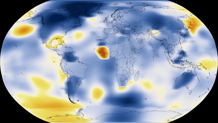 CLICK ON IMAGE TO ACCESS INTERACTIVE MAP: This color-coded map shows a progression of changing global surface temperatures from 1884 to 2016. Dark blue indicates areas cooler than average. Dark red indicates areas warmer than average.
Why should we care? After all, the temperature fluctuates by many degrees every day where we live. The global temperature record represents an average over the entire surface of the planet. The temperatures we experience locally and in short periods can fluctuate significantly due to predictable cyclical events (night and day, summer and winter) and hard-to-predict wind and precipitation patterns. But the global temperature mainly depends on how much energy the planet receives from the Sun and how much it radiates back into space—quantities that change very little. The amount of energy radiated by the Earth depends significantly on the chemical composition of the atmosphere, particularly the amount of heat-trapping greenhouse gases. A one-degree global change is significant because it takes a vast amount of heat to warm all the oceans, atmosphere, and land by that much. In the past, a one- to two-degree drop was all it took to plunge the Earth into the Little Ice Age. A five-degree drop was enough to bury a large part of North America under a towering mass of ice 20,000 years ago. The maps above show temperature anomalies, or changes, not absolute temperature. They depict how much various regions of the world have warmed or cooled when compared with a base period of 1951-1980. (The global mean surface air temperature for that period was estimated to be 14°C (57°F), with an uncertainty of several tenths of a degree.) In other words, the maps show how much warmer or colder a region is compared to the norm for that region from 1951-1980. Read more here
It’s Not Your Imagination. Summers Are Getting Hotter

28 July 2017, New York Times, It’s Not Your Imagination. Summers Are Getting Hotter. Extraordinarily hot summers — the kind that were virtually unheard-of in the 1950s — have become commonplace. This year’s scorching summer events, like heat waves rolling through southern Europe and temperatures nearing 130 degrees Fahrenheit in Pakistan, are part of this broader trend. The chart above, based on data from James Hansen, a retired NASA climate scientist and professor at Columbia University, shows how summer temperatures have shifted toward more extreme heat over the past several decades. To create the bell curves, Dr. Hansen and two colleagues compared actual summer temperatures for each decade since the 1980s to a fixed baseline average. During the base period, 1951 to 1980, about a third of local summer temperatures across the Northern Hemisphere were in what they called a “near average” or normal range. A third were considered cold; a third were hot. Since then, summer temperatures have shifted drastically, the researchers found. Between 2005 and 2015, two-thirds of values were in the hot category, and nearly 15 percent were in a new category: extremely hot. Practically, that means most summers are now either hot or extremely hot compared with the mid-20th century. Access interactive graphic and full article here
Greenhouse gases rapidly changing atmosphere
 13 July 2017, Climate Central, Greenhouse Gases Are Rapidly Changing the Atmosphere. Humanity’s grand experiment in the atmosphere continues, and a new report documents just how far it’s gone. On Tuesday, the National Oceanic and Atmospheric Administration released its annual index of 20 key greenhouse gases. It shows that their direct influence on the climate has risen 140 percent since 1750, with 40 percent of that rise coming in just the past 26 years. That increase is almost entirely due to human activities and has caused the planet to warm 1.8°F (1°C) above pre-industrial temperatures. The index takes greenhouse gas measurements from about 80 ships and observatories around the world — gathered in all their parts per million and parts per billion glory — and boils them down into a simple numerical index, which defines the rise from 1700-1990 as 100 percent or simply 1. This year’s number: 1.4. It’s a simple number that contains multitudes. For example, carbon dioxide’s influence on the climate has increased 54 percent overall since 1990. The four other major greenhouse gases in the index, which include nitrous oxide, methane and two types of chlorofluorocarbons, are responsible for 42 percent of the increase with 15 minor greenhouse gases accounting for the missing 4 percent. Carbon dioxide has risen rapidly in the atmosphere, with 2016 marking the second-largest annual increase ever observed at the Mauna Loa Observatory, the world’s main measuring station. This May, monthly carbon dioxide peaked at 409.65 parts per million. That’s a record high and a mark unseen in human history. If emissions continue on their current trend, the atmosphere will hit a state unseen in 50 million years. A bright spot in the report is the decline of chlorofluorocarbons’ warming influence on the planet. The chemicals were commonly used as refrigerants until the Montreal Protocol banned them in 1989. The treaty came about because they deplete the protective ozone layer, but phasing them out has also helped reduce their warming impact on the climate. Read More here (GRAPH: Radiative forcing, relative to 1750, of all the long-lived greenhouse gases. The NOAA annual greenhouse gas index, which is indexed to 1 for the year 1990, is shown on the right axis.Credit: NOAA)
What does pre-industrial levels mean?
 8 June 2017, The Conversation, What is a pre-industrial climate and why does it matter? Over the past few days there has been a lot of talk about the Paris climate agreement, from which the United States is planning to withdraw. Although this is a setback, there is still near-complete consensus from the world’s governments that a strong effort to tackle climate change is needed. The Paris Agreement aims to limit global warming relative to a pre-industrial baseline. Its precise commitment is: Holding the increase in the global average temperature to well below 2℃ above pre-industrial levels and to pursue efforts to limit the temperature increase to 1.5℃ above pre-industrial levels, recognising that this would significantly reduce the risks and impacts of climate change. But this begs the question: what are “pre-industrial levels”? Clearly, if we’re aiming to limit global warming to 1.5℃ or 2℃ above a certain point, we need a common understanding of what we’re working from. But the Paris Agreement doesn’t provide a definition. This becomes key as governments expect climate scientists to coherently compare different plans to reach their Paris targets. It’s crucial to be clear on what researchers mean when we say “pre-industrial”, and what assumptions our projections are based on. Of course, as the chart below shows, no matter which baseline we use it’s clear there’s been a drastic rise in global temperature over the last century. Read More here
Provisional WMO Statement on the Status of the Global Climate in 2016
14 November 2016: 2016 is set to break even the temperature records of 2015. It is very likely that 2016 will be the hottest year on record, with global temperatures even higher than the record-breaking temperatures in 2015. Preliminary data shows that 2016’s global temperatures are approximately 1.2° Celsius above pre-industrial levels, according to an assessment by the World Meteorological Organization (WMO).  Global temperatures for January to September 2016 have been about 0.88° Celsius (1.58°F) above the average (14°C) for the 1961-1990 reference period, which is used by WMO as a baseline. Temperatures spiked in the early months of the year because of the powerful El Niño event of 2015-16. Preliminary data for October indicate that they are at a sufficiently high level for 2016 to remain on track for the title of hottest year on record. This would mean that 16 of the 17 hottest years on record have been this century (1998 was the other one).
Access Provisional Statement here. Access full WMO report here
Today’s extremes, tomorrow’s normal
7 November 2016, The Conversation. The recent record-breaking temperatures have often been described as the “new normal”. For example, after the new global temperature record was set in 2016, these high temperatures were described as a new normal. What is a new normal for our climate? The term has been used broadly in the media and in scientific literature to make sense of climate change. Put simply, we should get used to extremes temperatures, because our future will be extreme.
Extreme heat events increasing.
But without a precise definition, a new normal is limited and difficult to understand. If 2015 was a new normal for global temperatures, what does it mean if 2017, 2018, or 2019 are cooler? In our study we defined the new normal as the point in time when at least half the following 20 years are warmer than 2015’s record breaking global temperatures. We examined extreme temperatures in a number of state-of-the-art climate models from an international scientific initiative. We also explored how different future greenhouse gas emissions impact temperatures. We used four different greenhouse gas scenarios, known as Representative Concentration Pathways, or RCPs. These range from a business-as-usual situation (RCP8.5) to a major cut to emissions (RCP2.6). It is worth emphasising that real-world emissions are tracking above those covered by these hypothetical storylines.
Future extremes: Our findings were straightforward. 2015’s record-breaking temperatures will be the new normal between 2020 and 2030 according to most of the climate models we analysed. We expect within a decade or so that 2015’s record temperatures will likely be average or cooler than average.
By 2040, 2015’s temperatures were average or cooler than average in 90% of the models. This result was unaffected by reducing greenhouse gas emissions or not – we are already locked in to a significant amount of further warming. Read More here Access full AMERICAN METEOROLOGICAL SOCIETY Report here
Interactive animation of monthly global surface temperatures from 1850 to 2016
14 December 2016, MET UK: Explore their interactive animation of monthly global surface temperatures from 1850 to 2016, and some of the key events that have influenced this 166-year-long record. This interactive animation is a collaboration between the Met Office Informatics Lab and the Met Office Hadley Centre. NOTE: Click on graphic to access animation, when open click and hold on globe to view different parts of the globe.
Understanding climate models (Ted Talk video)
Gavin Schmidt, Director of the NASA Goddard Institute for Space Studies: The emergent patterns of climate change (2014). You can’t understand climate change in pieces, says climate scientist Gavin Schmidt. It’s the whole, or it’s nothing. In this illuminating talk, he explains how he studies the big picture of climate change with mesmerizing models that illustrate the endlessly complex interactions of small-scale environmental events. Access Ted Talks here
Scientists find common ground over climate sensitivity.
 28 June 2016, Carbon Brief, A new paper helps to shed light on one of the biggest questions in climate science: how much the climate will warm in future? The answer to this depends a lot on something scientists call the “climate sensitivity” – a measure of how much the climate warms in response to greenhouse gases. Until now, scientists have been grappling with how to reconcile the fact that different ways to estimate the climate sensitivity have, so far, come up with quite different answers. This uncertainty has never been a reason to question whether climate change will be serious or to delay action to tackle emissions, though it has often be misused by climate skeptics this way. But a question mark over the value of climate sensitivity has meant that projections of future temperature rise are less precise than scientists would like. It also makes it harder to gauge our chances of staying below a given temperature limit, such as 2C above pre-industrial levels. A new paper published in Nature Climate Change says there is, in fact, no disagreement between the different methods after all. In reality, they measure different things and once you correct for the fact that the historical temperature record underestimates past warming, the gap closes. The implications are significant since it suggests we’ve seen around 0.2C more warming than previously thought, says co-author Dr Ed Hawkins in his Climate Lab Book blog. Read More here
Another way of looking at how temp increases – by trend or steps??
12 July 2023, The Conversation: Global temperature rises in steps – here’s why we can expect a steep climb this year and next 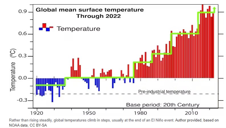 Global warming took off in the mid-1970s when the rise in global mean surface temperature exceeded natural variability. Every decade after the 1960s has been warmer than the one before and the 2010s were the warmest on record. But there can be a lot of variability from one year to the next. Now, in 2023, all kinds of records are being broken. The highest daily temperatures ever recorded globally occurred in early July, alongside the largest sea surface temperature anomaly ever.
But global mean surface temperature does not continue relentlessly upwards. The biggest increases, and warmest years, tend to happen in the latter stages of an El Niño event. Human-induced climate change is relentless and largely predictable. But at any time, and especially locally, it can be masked by weather events and natural variability on interannual (El Niño) or decadal time scales. The combination of decadal variability and the warming trend from rising greenhouse gas emissions makes the temperature record look more like a rising staircase, rather than a steady climb. Read more here
Research being put forward by Prof. Roger Jones Victoria Institute of Strategic Economic Studies (VISES), Victoria University, Melbourne Website
WHY IT IS IMPORTANT: Step changes in warming of a few tenths to 1°C can produce rapid changes in risks such as extreme heat and fire danger. Yet, adaptation-planning that follows the dominant model of smooth climate change makes gradual adjustments to keep up with small changes in extremes. In these circumstances, a rapid change can catch sensitive systems out. Poorly planned responses may also lead to maladaptation.
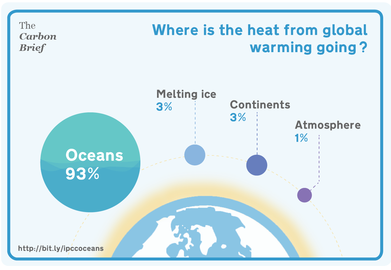
The Basics: The main reason for step-like increases in warming is most probably the ocean, which absorbs about 85% of the energy from greenhouses gases as stored heat. This heat builds up and is re-emitted periodically into the atmosphere. The timing of these changes suggests that climate variability is playing a part in the storage and release process.
Ocean storage of heat is the main reason why atmospheric warming takes decades to centuries to respond fully to changes in greenhouse gas concentrations in the atmosphere. The evidence is that this heat is being released in bursts. Circumstantial evidence suggests that rainfall may also be changing in response to these shifts, as has occurred in south-western Western Australia, but more research is required.
GRAPH: Historical annual stream-flows into Perth dams (GL/year). Source: http://watercorporation.com.au/
Time to stop hiding behind warming trends
23 February 2013 The Conversation (Prof Roger Jones).…Climatology needs to stop hiding behind long-term trends and explain what is in plain sight, and why variations in the rate of warming might be important. I’m working with colleagues at the moment on a National Climate Change Adaptation Research Facility project called Valuing Adaptation to Rapid Change and we’re looking at the economics of rapid change. Non-linear behaviour in climate driving extreme events has the potential to really hurt us.
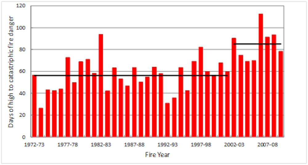
GRAPH: Days above high fire danger, average of 9 Victorian sites, showing statistically significant rapid increase (site data from Bureau of Meteorology)
It’s time to stop defending orthodox science by hiding behind simple trends and come to grips with the fundamental non-linearity of climate change. That’s the risk we need to mitigate, adapting to changes that can’t be avoided.
Rapid warming in SE Australia challenges plans to adapt gradually
March 30, 2012, The Conversation (Prof Roger Jones) Step changes in warming of a few tenths to 1°C can produce rapid changes in risks such as extreme heat and fire danger. Yet, adaptation-planning that follows the dominant model of smooth climate change makes gradual adjustments to keep up with small changes in extremes. In these circumstances, a rapid change can catch sensitive systems out. Poorly planned responses may also lead to maladaptation.
Access “Step change hypothesis and working paper” (2016)
RESEARCH PAPER: Reconciling the signal and noise of atmospheric warming on decadal timescales (March 2017)
CONCLUSION EXTRACT: Climate conceptualised as a mechanistic system and described using classical statistical methods is substantially different from climate conceptualised as a complex system.With record atmospheric and surface ocean temperatures in 2015/16 variously being described as a singular event, a reinvigoration of trend-like warming or a wholesale shift to a new climate regime, this issue is too important to be left unresolved.
This chart perfectly explains what’s at stake in the quest to stop climate change
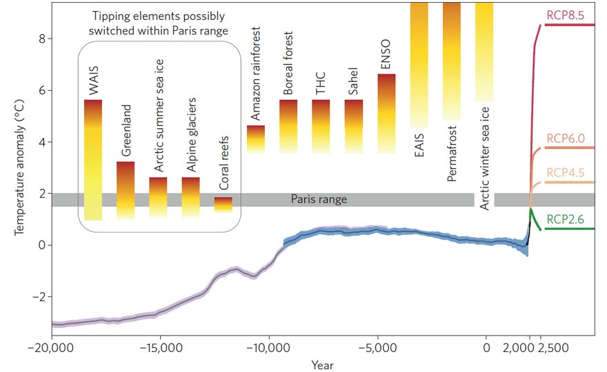 23 June 2016, Washington Post: Here at the Energy and Environment blog, we cover, regularly, the tipping points of climate change — how, for instance, the glaciers of West Antarctica may already have passed a key threshold that leads to unstoppable melt. We cover the history of the Earth’s climate — including why the Holocene era, which began some 11,700 years ago and we lived in up until fairly recently (when many researchers believe an “Anthropocene” began), was so stable and conducive to human civilization. And of course we cover the quest to keep warming below the Paris climate targets, 1.5 degrees and 2 degrees Celsius, and the scenarios for greenhouse gas emissions that might be capable of doing that — and also those that can’t. [The math the planet relies on isn’t adding up right now] But these are all complicated, nuanced stories, and the idea that they can all be pulled together into one analysis — much less one figure — is hard to believe. Nonetheless, I think three researchers from the Potsdam Institute for Climate Impact Research have done precisely that with the image below, which is part of an optimistic essay they just published in Nature Climate Change, suggesting that the recently negotiated Paris climate agreement has what it takes to stabilize climate change. In the process, the researchers deliver the sort of rare big picture analysis that we mortals need now and again to understand why scientists are generally so freaked about a warming climate, and also why, in this case, they’re feeling a shard of hope.
Click on image above to enlarge, with unpacking following: Schellnhuber et al., Nature Climate Change. The figure shows, according to the authors, the “global mean surface temperature evolution from the Last Glacial maximum through the Holocene,” combined with the temperature range aspired to in the Paris climate agreement, possible temperature rises for different greenhouse gas emissions scenarios (RCP2.6, RCP8.5, and so on), and the tipping point thresholds for various major planetary changes. Access full article here
Yet another way to visualise temperature rise – How many do we need?
 The animated spiral presents global temperature change in a visually appealing and straightforward way. The pace of change is immediately obvious, especially over the past few decades. The relationship between current global temperatures and the internationally discussed target limits are also clear without much complex interpretation needed. Click on graphic to go to animated spiral.
Data: HadCRUT4.4 from January 1850 – March 2016, relative to the mean of 1850-1900, available here
FAQ:
1. Features you can see:
1877-78: strong El Nino event warms global temperatures
1880s-1910: small cooling, partially due to volcanic eruptions
1910-1940s: warming, partially due to recovery from volcanic eruptions, small increase in solar output and natural variability
1950s-1970s: fairly flat temperatures as cooling sulphate aerosols mask the greenhouse gas warming
1980-now: strong warming, with temperatures pushed higher in 1998 and 2016 due to strong El Nino events
2. Why start in 1850? Because that is when the HadCRUT4 dataset starts, as we don’t have enough temperature data before then to reliably construct global average temperature
3. Are temperatures ‘spiralling out of control’? No. Humans are largely responsible for past warming so we have control over what happens next.
4. What do the colours mean? The colours represent time. Purple for early years, through blue, green to yellow for most recent years. The colour scale used is called ‘viridis’ and the graphics were made in MATLAB.
Source: Climate Lab Book
21 January 2016, NASA, NOAA Analyses Reveal Record-Shattering Global Warm Temperatures in 2015
The planet’s average surface temperature has risen about 1.8 degrees Fahrenheit (1.0 degree Celsius) since the late-19th century,
Earth’s 2015 surface temperatures were the warmest since modern record keeping began in 1880, according to independent analyses by NASA and the National Oceanic and Atmospheric Administration (NOAA). Globally-averaged temperatures in 2015 shattered the previous mark set in 2014 by 0.23 degrees Fahrenheit (0.13 Celsius). Only once before, in 1998, has the new record been greater than the old record by this much……The planet’s average surface temperature has risen about 1.8 degrees Fahrenheit (1.0 degree Celsius) since the late-19th century, a change largely driven by increased carbon dioxide and other human-made emissions into the atmosphere. Access data here and NOAA/NASA Annual Global Analysis for 2015 here
CO2 increasing but why do the levels go up and down?
15 May 2015, Climate Central: The reason that CO2 is building up to higher levels each year is related to the seasonal cycle. While plants take up CO2 as they awaken after their winter hibernation, and then release it again as they go dormant again in the fall, they can only sop up so much in a given season, leaving behind an ever-growing excess amount. 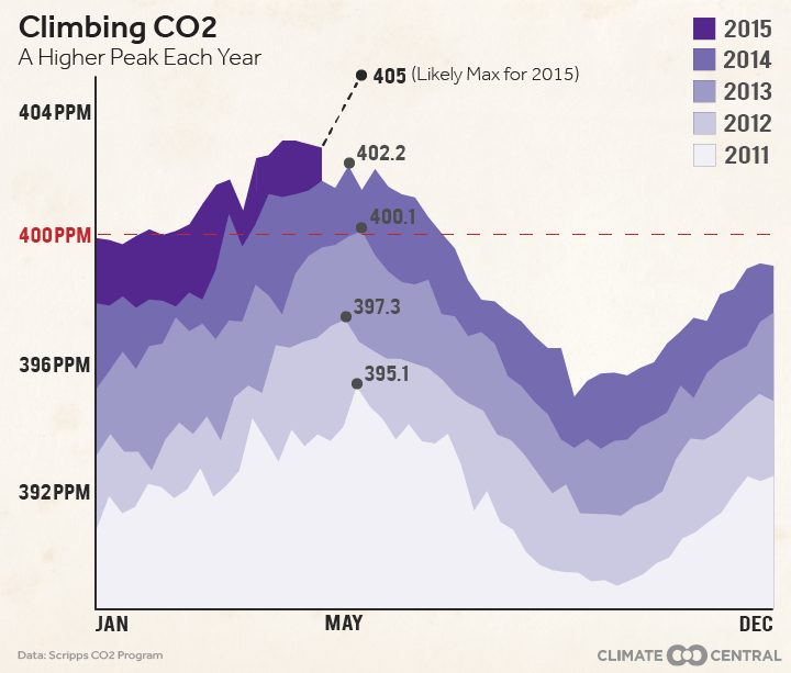
Right now, that excess is to the tune of about an extra 2 ppm accumulating in the atmosphere every year. That means that the CO2 peak that comes each May is around 2 ppm higher than it was the year before, as shown in the graph below. This year, that peak is expected to be around 405 ppm. But not only is the amount of CO2 in the atmosphere going up every year, the amount by which it is doing so is accelerating; back in the 1950s, the yearly increase was only about 0.75 ppm per year. The rate of that acceleration is a factor of human CO2 emissions,
Global average carbon dioxide concentrations as seen by NASA’s Orbiting Carbon Observatory-2 mission, June 1-15, 2015. OCO-2 measures carbon dioxide from the top of Earth’s atmosphere to its surface. Higher carbon dioxide concentrations are in red, with lower concentrations in yellows and greens. Credit: NASA/JPL-Caltech
29 October 2015, NASA Global Climate Change, Armed with a full annual cycle of data, OCO-2 scientists are now beginning to study the net sources of carbon dioxide as well as their “sinks” — places in the Earth system that store carbon, such as the ocean and plants on land. This information will help scientists better understand the natural processes currently absorbing more than half the carbon dioxide emitted into the atmosphere by human activities. This is a key to understanding how Earth’s climate may change in the future as greenhouse gas concentrations increase. Read More here
Why are nights heating up faster than days?
10 March 2016, Bjerknes Centre, Observations from the last fifty years have shown that the nights have been warming much faster than the days. Analysis of the causes of this more rapid warming at night shows that this is likely to continue in the coming decades. A new publication led by Richard Davy, researcher at the Nansen Centre and the Bjerknes Centre has examined the causes of the more rapid warming at night compared to the day, which has been seen around the globe in recent decades. They have analysed the causes of these changes from observations and model reconstructions of the climate in the 20th century. By using model reconstructions they were able to determine how much of this asymmetrical warming could be explained by different processes. Past efforts to understand the reason for this enhanced warming have focused on changes to climate processes that may have occurred at this time, such as increases in cloud cover, precipitation or soil moisture content. However, Davy and colleagues have shown that part of this more rapid warming at night is innate to the climate system, because the night-time temperatures are inherently more sensitive to climate forcing.
(Cartoon on the diurnal cycle by Richard Davy)
The layer of air just above the ground is known as the boundary-layer, and it is essentially separated from the rest of the atmosphere. At night this layer is very thin, just a few hundred meters, whereas during the day it grows up to a few kilometres. It is this cycle in the boundary-layer depth which makes the night-time temperatures more sensitive to warming than the day. The build-up of carbon dioxide in the atmosphere from human emissions reduces the amount of radiation released into space, which increases both the night-time and day-time temperatures. However, because at night there is a much smaller volume of air that gets warmed, the extra energy added to the climate system from carbon dioxide leads to a greater warming at night than during the day. Read More here
How a global average of 2oC does not mean its the same temp rise everywhere
20 January 2016, Eureka Alert (Uni NSW) How a 2°C rise means even higher temperatures where we live. Land based temperatures rise much faster than global average temperatures
IMAGE: THE INCREASE IN REGIONAL AVERAGE TEMPERATURES AROUND THE WORLD WHEN GLOBAL AVERAGE TEMPERATURES REACH 2°C ABOVE PRE-INDUSTRIAL LEVELS. view more CREDIT: (FROM AUTHORS’ NATURE PAPER, ALLOWABLE CO2 EMISSIONS BASED ON REGIONAL AND IMPACT-RELATED CLIMATE TARGETS).
Regions around the Arctic may have passed a 2°C temperature rise as far back as 2000 and, if emissions rates don’t change, areas around the Mediterranean, central Brazil and the contiguous United States could see 2°C of warming by 2030. This is despite the fact that under a business as usual scenario the world is not expected to see global average temperatures rise by 2°C compared to preindustrial times until the 2040s. New research published in Nature led by Prof Sonia Seneviratne from ETH Zurich with researchers from Australia’s ARC Centre of Excellence for Climate System Science (ARCCSS) has quantified the change in regional extremes in a world where global average temperatures have risen by 2°C. The research shows worldwide warming extremes over land generally exceed the rise in this scenario, in some cases by as much as 6°C. “We even see starkly different rates of extreme warming over land even when global average temperatures reach just 1.5°C, which is the limit to the rate of warming agreed to at the Paris talks,” said lead author Prof Seneviratne. “At 1.5°C we would still see temperature extremes in the Arctic rise by 4.4°C and a 2.2°C warming of extremes around the Mediterranean basin.” The extreme regional warming projected for Alaska, Canada, Northern Europe, Russia and Greenland could have global impacts, accelerating the pace of sea-level rise and increasing the likelihood of methane releases prompted by the melting of ice and permafrost regions. Read More here
NOAA Global Temperature and Precipitation Maps
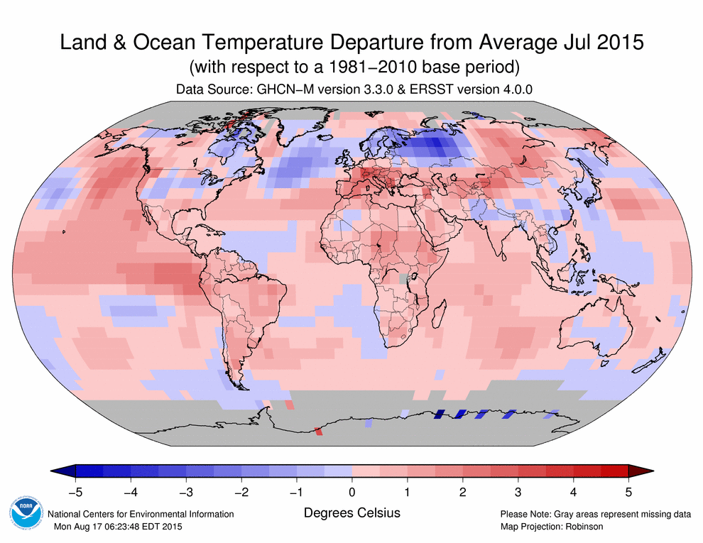
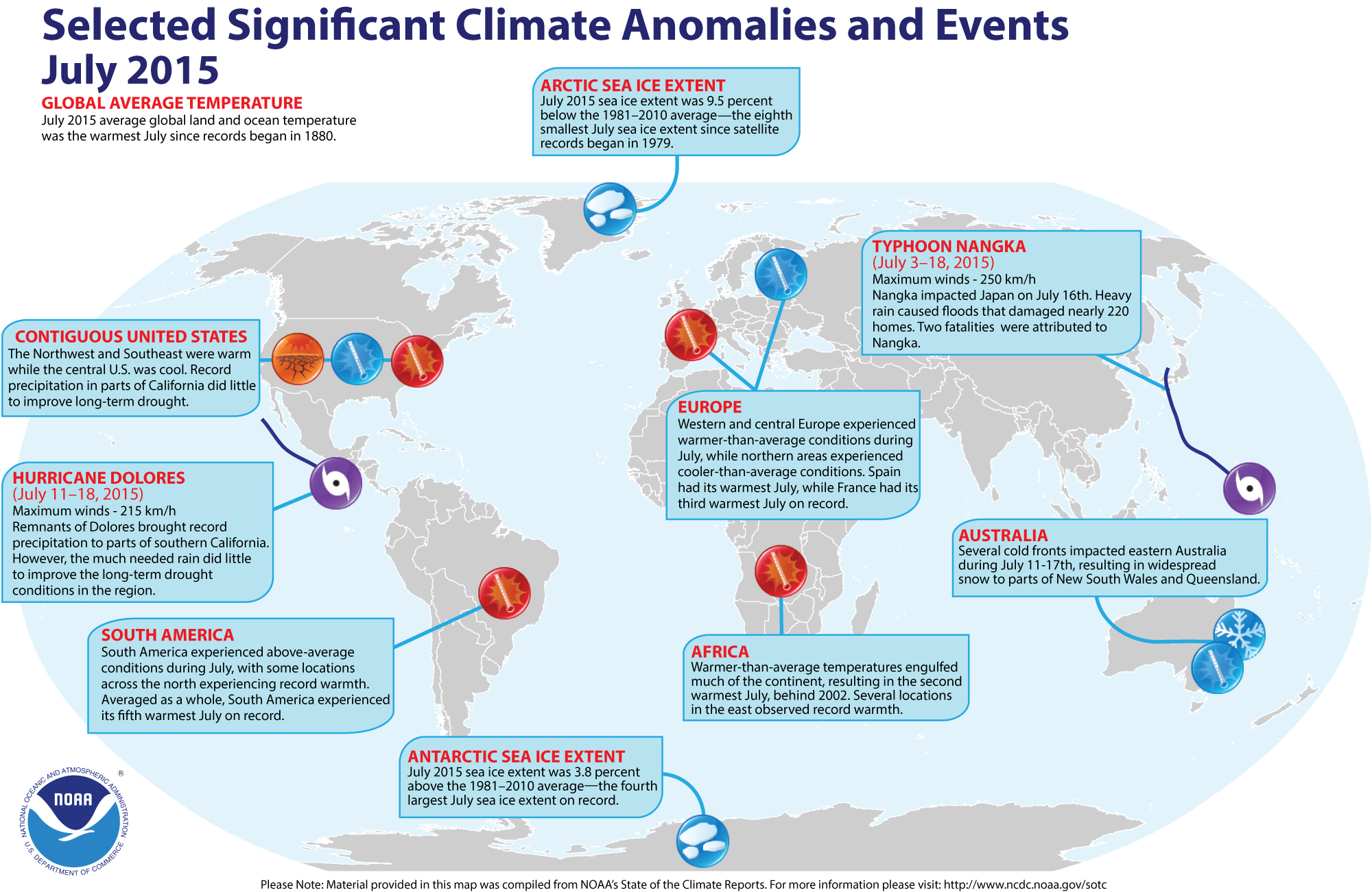
For more maps and data go to NOAA’s site here
29 July 2015, The Carbon Brief Updated: The climate change papers most featured in the media
NASA’s New Climate Projections, Now On the Cloud
12 June 2015, NASA RELEASE: NASA has put a new item up on Amazon. But there’s no price tag and you won’t necessarily find it by using the marketplace’s search bar or browsing the electronics section. Instead, you’ll have to look at Amazon’s cloud, where NASA scientists have shared 11 terabytes of high resolution climate projections. A snapshot of July in 2100 in the map below shows how detailed the projections are (global high temperatures in July 2100 under high greenhouse emissions). The new dataset is available to anyone with an internet connection, but comes courtesy of supercomputers only available to NASA scientists and a lucky handful of grantees. If you want to access the data set go here.
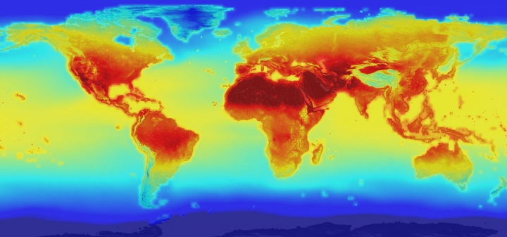
Where did the “97%” of climate scientist agree with man-made global warming” come from?
15 May 2013, IOP Science
For full transcript access link here
What makes a climate scientist take to the streets
Top climate scientist James Hansen tells the story of his involvement in the science of and debate over global climate change. In doing so he outlines the overwhelming evidence that change is happening and why that makes him deeply worried about the future.
Source: Ted Talks
Hansen causing controversy over new report published prior to being peer reviewed
23 July 2015, Washington Post, It has been widely discussed — but not yet peer reviewed. Now, though, you can at least read it for yourself and see what you think. A lengthy, ambitious, and already contested paper by longtime NASA climate scientist James Hansen and 16 colleagues appeared online Thursday in Atmospheric Chemistry and Physics Discussion, an open-access journal published by the European Geosciences Union. The paper, entitled “Ice melt, sea level rise and superstorms: evidence from paleoclimate data, climate modeling, and modern observations that 2 ◦C global warming is highly dangerous” is now open for comment — peer review in this journal happens in public. And given how much attention the work has already received, it’s likely to generate plenty of comments from fellow scientists. Read More here. Access full report here
15 December 2015, YALE Climate Connections: James Hansen Calls Out ‘Baloney’ on COP21 Climate Progress. Citing climate ’emergency,’ the scientist-turned activist is unimpressed with COP21 outcome, opts for nuclear – but not carbon capture and sequestration – in ‘all hands on deck’ approach…..“We really have an emergency because of the inertia of the system,” Hansen said – or, as his grandson put it, unless we have a time machine, we can’t fix much of the climate change happening now and in the future. “A solution is possible, and economic[ally] sensible, and it’s not been being advocated by any nation,” said Hansen, who expressed frustration about the outcome of the recent COP21 climate conference in Paris. He said the idea that the world is “making good progress” is “baloney.” Hansen’s preferred solution is a carbon fee-and-dividend, with all collected fees (taxes) distributed back on an equal per capita basis. Such a system has been backed also by groups such as the Citizens Climate Lobby. Read more here
Two Degrees “safe limit” and why did they pick it?
8 December 2014, Carbon Brief, Two degrees: The history of climate change’s ‘speed limit’: Limiting warming to no more than two degrees has become the de facto target for global climate policy. But there are serious questions about whether policymakers can keep temperature rise below the limit, and what happens if they don’t. As climate negotiators meet in Lima to discuss a new global climate deal that could limit warming to two degrees or less, we look at each of the issues in turn. Here, we take a look at where the two degree target came from, and how it has ended up guiding international climate policy. Read More here
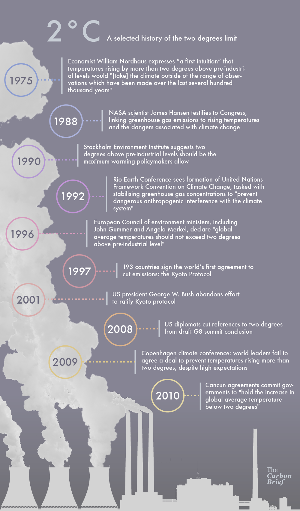
And is this a sensible way to decide what is “safe”?
15 June 2015, The Carbon Brief an In-depth analysis: Is the 1.5C global warming goal politically possible? For the past five years, international climate change negotiations have been guided by the principle that the rise in global average temperatures should be limited to “below 2C above pre-industrial levels”. Is this goal adequate? Probably not, according to a report conducted by the UN and launched at the climate change negotiations in Bonn. Containing the views of 70 scientists gathered together in a process called the ” structured expert dialogue” (SED), the report warns that even current levels of global warming – around 0.85C – are already intolerable in some parts of the world. It says: “Some experts warned that current levels of warming are already causing impacts beyond the current adaptive capacity of many people, and that there would be significant residual impacts even with 1.5C of warming (e.g. for sub-Saharan farmers), emphasising that reducing the limit to 1.5C would be nonetheless preferable.” This report provides the evidence base for discussions at UN level over whether the world is being ambitious enough on long-term action to tackle climate change.
The main finding of the SED report is that the 2°C limit is indeed too warm for many vulnerable systems and regions, and a 1.5°C limit would be significantly safer. In addition, the SED advises that 2°C should not be seen as a guardrail, but rather a defence line, that should not be crossed. And if we want to be sure not to cross it, we should actually aim for a 1.5°C limit.
And perhaps one of the most important implications in the short term of the SED findings is its advice to “avoid embarking on a pathway that unnecessarily excludes a warming limit below 2 °C.” These results confirm the views of the most vulnerable groups, like the SIDS and LDCs, who have pushed for a 1.5°C limit since the Copenhagen meeting. The report underscores the scientific legitimacy and significance of their case. It is now important that these findings make their way into the negotiations on the new global agreement now underway and scheduled to conclude in Paris in December 2015. You can read Climate Analytics’ briefing on the main points covered by the SED here.
Climate talks in Bonn: While the message of the report is clear, it does not close the current chasm between climate science and policy. At UN climate negotiations in Bonn last week, the report and its findings were subject to intense scrutiny and discussion by diplomats from around the world. It is these policymakers – not the scientists – who get the final say on whether the findings become the new basis for future political decisions, embedded in a new international climate deal set to be signed at the end of this year in Paris.
The views of diplomats around the world differ widely on how the findings of the report should be incorporated. At the most hopeful end of the scale, countries want to include an official decision that “there is a need to strengthen the global goal on the basis of limiting warming to below 1.5C above pre-industrial levels”. A minority would rather ignore the report – the product of two years’ work – altogether. In any case, two weeks of discussions ended in an outcome that most had hoped to avoid: just two short sentences acknowledging that a report had been written, and that countries would continue to discuss it when they meet again in Paris. Read More here
27 May 2015, The Conversation, A matter of degrees: why 2C warming is officially unsafe: The goal of international climate negotiations is “to avoid dangerous atmospheric concentrations of greenhouse gases”. In 2010, Parties to the United Nations Framework Convention on Climate Change formally recognised the “long term goal” of the convention was to hold the increase in global average warming to below 2C above pre-industrial levels. Is 2C therefore the safe limit above which climate change becomes “dangerous”? A UN expert dialogue of more than 70 scientists, experts, and climate negotiators recently released a final report concluding that 2C is “inadequate” as a safe limit. Read More here. View the full UN Report here. If you want just the basics scroll through to the message boxes.
05 May 2015, Climate Code Red: Hansen says “It’s crazy to think that 2 degrees Celsius is safe limit”…..Then there is the world of international policy-making, where the talk is of trying to keep warming to 2°C, when in fact the current level of commitments in the lead up to the Paris talks looks like normalising policies consistent with 3°C of warming. Today Fairfax media reported Lord Stern as recognising that the Paris commitments “would be like a path upwards of 3°C on the basis of current intentions… We haven’t been there for three million years and we haven’t been at four degrees for tens of millions of years.” Also today, the world’s most well-known and certainly one of the greatest climate scientists, James Hansen, told ABC Radio National Breakfast that “its crazy to think that 2 degrees Celsius is safe limit.” Read More here
The slow response (lag time) of the climate system
Figure 2.6 below shows estimates of the time it takes for different parts of the climate system to respond to a situation where emissions are reduced to equal the rate of natural removal. While greenhouse gas concentrations stabilise in around a hundred years, the temperature and sea-level rise due to thermal expansion of the oceans takes much longer to stabilise. The melting of ice sheets is still increasing the sea level even after a thousand years.
Figure 2.6 Inertia in the climate system
Source: IPCC (2001b: Figure 5.2), reformatted for this publication.
Another way of looking at how temp increases – by trend or steps??
Research being put forward by Prof. Roger Jones Victoria Institute of Strategic Economic Studies (VISES), Victoria University, Melbourne, Website | E-Mail
WHY IT IS IMPORTANT: Step changes in warming of a few tenths to 1°C can produce rapid changes in risks such as extreme heat and fire danger. Yet, adaptation-planning that follows the dominant model of smooth climate change makes gradual adjustments to keep up with small changes in extremes. In these circumstances, a rapid change can catch sensitive systems out. Poorly planned responses may also lead to maladaptation.
Access “Step change hypothesis and working paper” (2016)
RESEARCH PAPER: Reconciling the signal and noise of atmospheric warming on decadal timescales (March 2017)
CONCLUSION EXTRACT: Climate conceptualised as a mechanistic system and described using classical statistical methods is substantially different from climate conceptualised as a complex system.With record atmospheric and surface ocean temperatures in 2015/16 variously being described as a singular event, a reinvigoration of trend-like warming or a wholesale shift to a new climate regime, this issue is too important to be left unresolved.
Special Issue “The Implications of Nonlinear, Complex System Behaviour for Managing Changing Climate Risk”
There are two schools of thought about how the climate changes under increasing greenhouse gases. One school considers that the forced component and internal variability are independent, with externally-forced atmospheric warming being gradual, surrounded by the uncertainty of (nonlinear) climate variability.
The other school of thought considers that added warming enhances climate variability, which, over decadal time scales, is fundamentally nonlinear. These nonlinearities are associated with step-like changes in steady state climate regimes. Under increased forcing, the nonlinear behaviour associated with climate variability would be enhanced, leading to more frequent regime changes. These would likely manifest on regional scales, even though, under sustained forcing, global warming is expected to follow a complex trend.
With the IPCC Sixth Assessment Report in its early stages, there is a very limited literature on managing the risk of nonlinear climate change on decadal timescales, yet nonlinear change poses a much greater risk than gradual change. If climate change on decision-making timescales proves to be fundamentally nonlinear, there will be a substantial gap in the assessment. This special issue invites submissions on all aspects of the implications of nonlinear climate change for risk management, from theory through to practice. Submission deadline 30 June 2018